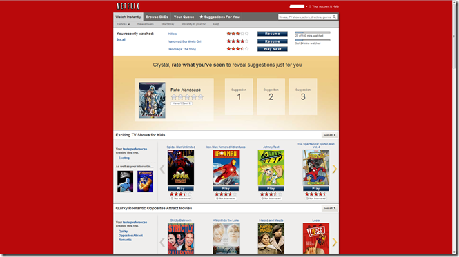
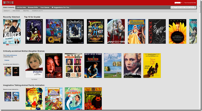
For those of you who have not signed into your Netflix account recently there has been a change made to the Netflix layout. Below you can see both of the layouts
Old Layout:
New Layout:
I seriously HATE the new layout with a passion. And a basic search on the internets has shown that I am not alone. Here are some links with lots of sympathizers.
- http://www.homemediamagazine.com/netflix/netflix-tweaks-streaming-interface-users-howl-24188
- http://blog.netflix.com/2011/06/new-look-and-feel-for-netflix-website.html
- http://www.webpronews.com/netflix-redesign-2011-06
- http://www.facebook.com/pages/Change-Netflix-Back/204414212935278
- http://www.facebook.com/home.php?sk=group_218498411517909¬if_t=group_r2j
- http://www.huffingtonpost.com/2011/06/09/netflixs-new-look-instant-play_n_874481.html
All of the previous links are full of people expressing their absolute hate for the new layout. On the Netflix blog there are over 2000 comments! most of them proclaiming hate for the new layout. So what do I dislike specifically about the new layout? here is my personal list.
- it is ugly. I like the nice fixed width page on a red background
- while it does show more movies the ratings are missing. you are required to mouse over each image and wait for the information to show up.
- the method of getting to the page where all of the reviews are located is not obvious
- the way that the scrolling is set up it gives me the feeling that my browser window is not fully expanded and there is not enough room on the page. Look at the last image in the top row of the New layout example image
- the scrolling is SUPER slow and annoying. My girlfriend says it makes her feel nauseous.
- I think the design uses an iframe or something so the navigation bar follows you as you scroll down. This means no matter how far I scroll it is still taking up real estate on the screen. (But I guess it also means that you don’t have to scroll up to get to the navigation bar, eh I dunno)
- When I first saw it, it made me feel like my web browser had failed to load the style sheets for the page. It just feels like a mistake.
- The new layout is just not intuitive at all.
So those are 8 reasons why I hate this new layout. I don’t know why the Netflix UI/UX guys would let this thing go live. On the huffington post link it seems that almost 40 percent of users hate the layout while the 35% or something are neutral. Any sort of focus group could have told them that the layout was junk. While it does put more emphasis on the movies this layout is not good for the PC version of the Netflix site. When you are on a PC and have more than a stupid PS3 or Wii controller to work with users want to have all of the information on their screen and at their fingertips.
If you agree with me, join the two facebook groups that I linked to previously. here are the links again:
- http://www.facebook.com/pages/Change-Netflix-Back/204414212935278
- http://www.facebook.com/home.php?sk=group_218498411517909¬if_t=group_r2j
Thanks and peace out!
Oh! I forgot to mention! for now the old UI still works if you use this link
http://www.netflix.com/WiHome?fcld=true
I don’t know how much longer it will work but at least for now it is something to fall back on.
Tags: horrible design, Just wrong, movie, Netflix, new layout, streaming, ugly website


more gold investment options here…
[…]Netflix New Layout is a Nightmare | The Ranting Jamaican[…]…
You have remarked very interesting points! ps decent site.
Magnificent goods from you, man. I’ve understand your stuff previous to and you’re just extremely magnificent.
I really like what you have received right
here, really like what you’re stating and
the best way wherein you are saying it. You make it enjoyable and you still take care of to keep it wise.
I can not wait to read far more from you. This is really a great website.
certainly like your web site but you need to check the spelling on quite a few of your posts. Several of them are rife with spelling issues and I find it very bothersome to tell the reality however I’ll surely come back again.